Documentation
Atlas UI Library
Official documentation for ROBLOX Atlas UI Library.
- Version: 1.2
- Developer: RoadToGlory
- Created: October 5, 2022
- Updated: December 21, 2022
Join our discord for updates, support, and other cool resources. Here is the invite.
Overview
Atlas UI Library is designed and programmed by RoadtoGlory#9879. Our priority is to be eye-pleasing and functional at the same time. Our library allows great control over how your UI will act while also making things simple and easy to understand for you developers.
Here is a showcase of everything Atlas has to offer up until this point:
Using Atlas Library
Getting The Library
The following code will load the library code and run it in ROBLOX.
local Atlas = loadstring(game:HttpGet("https://siegehub.net/Atlas.lua"))()Library Methods
Library.new
Usage:
Creates a new library window.
Note: You should only call this once in your script.
Example Usage:
local Atlas = loadstring(game:HttpGet("https://siegehub.net/Atlas.lua"))()

local UI = Atlas.new({
    Name = "My Script"; -- script name (required)
    ConfigFolder = "MyScript"; -- folder name to save configs to, set this to nil if you want to disable configs saving
    Credit = "Made By RoadToGlory#9879"; -- text to appear if player presses the "i" button on their UI (optional)
    Color = Color3.fromRGB(255,0,0); -- theme color for UI (required)
    Bind = "LeftControl"; -- keybind for toggling the UI, must be a valid KeyCode name
    -- Atlas Loader:
    UseLoader = true; -- whether to use Atlas Loader or not, if set to false than CheckKey and Discord are ignored
    FullName = "My Script Hub"; -- works if UseLoader is set to true, can be same as Name argument, shown on loader frame
    CheckKey = function(inputtedKey) -- works if UseLoader is set to true, where inputtedKey is the key inputted by the player
        return inputtedKey=="key1234"
    end;
    Discord = "https://discord.gg/xu5dDS3Pb9"; -- works if UseLoader is set to true, will be copied to clipboard if player presses "Copy Invite" button
})
Library:CreatePage
Usage:
Creates a page in your UI with parameter Name being the name of the page.
Example Usage:
local UI = Atlas.new({
    Name = "My Script";
    ConfigFolder = "MyScript";
    Credit = "Made By RoadToGlory#9879";
    Color = Color3.fromRGB(255,0,0);
    Bind = "LeftControl";
    UseLoader = true;
    FullName = "My Script Hub";
    CheckKey = function(inputtedKey)
        return inputtedKey=="key1234"
    end;
    Discord = "https://discord.gg/xu5dDS3Pb9";
})

local MyPage = UI:CreatePage("My First Page") -- creates a page
Library:Notify
Usage:
Shows a library notification on the bottom left corner of the player's screen with given arguments. Execute the sample code at the top of this page to see how this works and looks.
Example Usage:
local UI = Atlas.new({
    Name = "My Script";
    ConfigFolder = "MyScript";
    Credit = "Made By RoadToGlory#9879";
    Color = Color3.fromRGB(255,0,0);
    Bind = "LeftControl";
    UseLoader = true;
    FullName = "My Script Hub";
    CheckKey = function(inputtedKey)
        return inputtedKey=="key1234"
    end;
    Discord = "https://discord.gg/xu5dDS3Pb9";
})

UI:Notify({
  Title = "My Notification";
  Content = "Hi.";
})
Library:Toggle
Usage:
Toggles UI visibility to argument passed, either true or false.
If no argument is provided, it will toggle the UI's visibility to the opposite of its current state.
Note: This is used internally with the Bind argument of Library.new, so it is unlikely you would need to use this.
Example Usage:
local UI = Atlas.new({
    Name = "My Script";
    ConfigFolder = "MyScript";
    Credit = "Made By RoadToGlory#9879";
    Color = Color3.fromRGB(255,0,0);
    Bind = "LeftControl";
    UseLoader = true;
    FullName = "My Script Hub";
    CheckKey = function(inputtedKey)
        return inputtedKey=="key1234"
    end;
    Discord = "https://discord.gg/xu5dDS3Pb9";
})

UI:Toggle(false) -- will change UI's visibility to false

UI:Toggle(true) -- will change UI's visibility to true

UI:Toggle() -- will change UI's visibility to the opposite of its current state, which would be false
Library:SetToggle
Usage:
Sets UI's toggle bind, use "Unknown" to disable.
Note: This is only neccisary when changing the bind after the library is initiated, as this is handled at initiation internally.
Example Usage:
local UI = Atlas.new({
    Name = "My Script";
    ConfigFolder = "MyScript";
    Credit = "Made By RoadToGlory#9879";
    Color = Color3.fromRGB(255,0,0);
    Bind = "LeftControl";
    UseLoader = true;
    FullName = "My Script Hub";
    CheckKey = function(inputtedKey)
        return inputtedKey=="key1234"
    end;
    Discord = "https://discord.gg/xu5dDS3Pb9";
})

UI:SetToggle("E") -- sets UI toggle bind to KeyCode.E
Library:Destroy
Usage:
Destroys the UI, destroys any connections, and stops any coroutines. This method fully cleans up any trace of the UI.
Example Usage:
local UI = Atlas.new({
    Name = "My Script";
    ConfigFolder = "MyScript";
    Credit = "Made By RoadToGlory#9879";
    Color = Color3.fromRGB(255,0,0);
    Bind = "LeftControl";
    UseLoader = true;
    FullName = "My Script Hub";
    CheckKey = function(inputtedKey)
        return inputtedKey=="key1234"
    end;
    Discord = "https://discord.gg/xu5dDS3Pb9";
})

UI:Destroy() -- will destroy the UI
Page Methods
Page:CreateSection
Usage:
Creates a new section in the page with the given name. Page ordering is done in order, so if you create two pages, the first one you create will appear on top while the other is on the bottom.
Note: You must create a section in a page before creating an element, as creating elements is done through a section!
Example Usage:
local MyPage = UI:CreatePage("My First Page")

local MySection = MyPage:CreateSection("My Section") -- creates a section in page with the name passed. This argument is reqiured.
Section Methods
Section:CreateToggle
Usage:
Creates a new toggle element in given section using arguments passed in a table as a parameter.
Note: This method does not return anything, please modify flags directly in order to read or update the element's values.
Example Usage:
local MySection = MyPage:CreateSection("My Section")

MySection:CreateToggle({ -- IMPORTANT: This function does not return anything, please modify flags directly in order to read or update toggle values. SCROLL TO BOTTOM OF PAGE TO SEE HOW TO MODIFY FLAGS
    Name = "Toggle"; -- required: name of element
    Flag = "MyToggle"; -- required: unique flag name to use
    Default = true; -- optional: default value for toggle, will be used if config saving is disabled and there is no saved data, will be false if left nil
    Callback = function(newValue) -- optional: function that will be called when toggled, it is reccomended to modify flags directly
        print("Toggle:",newValue)
    end;
    -- Scroll to the bottom of the page to read more about the following two:
    Warning = "This has a warning"; -- optional: this argument is used in all elements (except for Body) and will indicate text that will appear when the player hovers over the warning icon
    WarningIcon = 12345; -- optional: ImageAssetId for warning icon, will only be used if Warning is not nil, default is yellow warning icon.
})
Section:CreateSlider
Usage:
Creates a new slider element in given section using arguments passed in a table as a parameter.
Note: This method does not return anything, please modify flags directly in order to read or update the element's values.
Example Usage:
local MySection = MyPage:CreateSection("My Section")

MySection:CreateSlider({ -- IMPORTANT: This function does not return anything, please modify flags directly in order to read or update toggle values. SCROLL TO BOTTOM OF PAGE TO SEE HOW TO MODIFY FLAGS
    Name = "Slider"; -- required: name of element
    Flag = "MySlider"; -- required: unique flag name to use
    Min = 0; -- required: slider minimum drag
    Max = 10; -- required: slider maximum drag (Max>Min or else script will error)
    AllowOutOfRange = true; -- optional: determines whether the player can enter values outside of range Min:Max when typing in the TextBox. If left nil, this is false
    Digits = 2; -- optional: digits for rounding when dragging or entering values, default is 0 (whole numbers)
    Default = 5; -- optional: default value for slider, will be used if config saving is disabled and there is no saved data, will be the Min value if left nil
    Callback = function(newValue) -- optional: function that will be called whenever slider flag is changed
        print("Slider:",newValue)
    end;
    -- Scroll to the bottom of the page to read more about the following two:
    Warning = "This has a warning"; -- optional: this argument is used in all elements (except for Body) and will indicate text that will appear when the player hovers over the warning icon
    WarningIcon = 12345; -- optional: ImageAssetId for warning icon, will only be used if Warning is not nil, default is yellow warning icon.
})
Section:CreateSliderToggle
Usage:
Creates a new slider with toggle element in given section using arguments passed in a table as a parameter.
Note: This method does not return anything, please modify flags directly in order to read or update the element's values. Also, this element does not have a Flag argument as it is split into ToggleFlag and SliderFlag instead.
Example Usage:
local MySection = MyPage:CreateSection("My Section")

MySection:CreateSliderToggle({ -- IMPORTANT: This function does not return anything, please modify flags directly in order to read or update toggle values. SCROLL TO BOTTOM OF PAGE TO SEE HOW TO MODIFY FLAGS
    Name = "Slider"; -- required: name of element
    SliderFlag = "Slider"; -- required: unique flag name to use for slider element
    ToggleFlag = "Toggle"; -- required: unique flag name to use for toggle element
    Min = 0; -- required: slider minimum drag
    Max = 10; -- required: slider maximum drag (Max>Min or else script will error)
    AllowOutOfRange = true; -- optional: determines whether the player can enter values outside of range Min:Max when typing in the TextBox. If left nil, this is false
    Digits = 2; -- optional: digits for rounding when dragging or entering values, default is 0 (whole numbers)
    SliderDefault = 5; -- optional: default value for slider, will be used if config saving is disabled and there is no saved data, will be the Min value if left nil
    ToggleDefault = false; -- optional: default value for toggle, will be used if config saving is disabled and there is no saved data, will be false if left nil
    SliderCallback = function(newValue) -- optional: function that will be called whenever slider flag is changed
        print("Slider:",newValue)
    end;
    ToggleCallback = function(newValue) -- optional: function that will be called whenever toggle flag is changed
        print("Toggle:",newValue)
    end;
    -- Scroll to the bottom of the page to read more about the following two:
    Warning = "This has a warning"; -- optional: this argument is used in all elements (except for Paragraph) and will indicate text that will appear when the player hovers over the warning icon
    WarningIcon = 12345; -- optional: ImageAssetId for warning icon, will only be used if Warning is not nil, default is yellow warning icon.
})
Section:CreateParagraph
Usage:
Creates a new paragraph element in given section using arguments passed in a table as a parameter.
Note: This method returns a table that you can use to update the paragraph element's text content. Read in the example usage for more information. This is the only element that does not have support for warning and warning icons.
Example Usage:
local MySection = MyPage:CreateSection("My Section")

local MyParagraph = MySection:CreateParagraph("Hello world!") -- creates a paragraph element with "Hello world!" as the text content

MyParagraph.Set("Hello world again!") -- updates the paragraph element with new text. Note how you do not use namecalling (MyParagraph:Set) and instead we use MyParagraph.Set
Section:CreateButton
Usage:
Creates a new button element in given section using arguments passed in a table as a parameter.
Note: This method does not return anything, please modify flags directly in order to read or update the element's values.
Example Usage:
local MySection = MyPage:CreateSection("My Section")

MySection:CreateButton({
    Name = "My Button"; -- required: name of element
    Callback = function() -- required: function to be called when button is pressed
        print("Button pressed!")
    end
})
Section:CreateTextBox
Usage:
Creates a new text box element in given section using arguments passed in a table as a parameter.
Note: This method does not return anything, please modify flags directly in order to read or update the element's values.
Example Usage:
local MySection = MyPage:CreateSection("My Section")

MySection:CreateTextBox({
    Name = "TextBox"; -- required: name of element
    Flag = "MyTextBox"; -- required: unique flag name to use
    Callback = function(inputtedText,enterPressed) -- function to be called when the textbox's focus is lost
        print("TextBox:",inputtedText,enterPressed)
    end;
    DefaultText = "DefaultText"; -- required: text that will be in the textbox when there is no configurations saved or config saving is disabled
    PlaceholderText = "No Text"; -- optional: placeholder text that will show when no text is written
    TabComplete = function(inputtedText) -- optional: function to be called when the player presses the tab button while the textbox is in focus. The replaced text will be whatever this function returns, if it returns nil, the text will not change
        if inputtedText=="Road" then
            return "RoadToGlory"
        end
    end;
    ClearTextOnFocus = true; -- optional: whether to clear text when the textbox is focused, default is false
    -- Scroll to the bottom of the page to read more about the following two:
    Warning = "This has a warning"; -- optional: this argument is used in all elements (except for Body) and will indicate text that will appear when the player hovers over the warning icon
    WarningIcon = 12345; -- optional: ImageAssetId for warning icon, will only be used if Warning is not nil, default is yellow warning icon.
})
Section:CreateInteractable
Usage:
Creates a new interactable element in given section using arguments passed in a table as a parameter.
Note: This method does not return anything, please modify flags directly in order to read or update the element's values.
Example Usage:
local MySection = MyPage:CreateSection("My Section")

MySection:CreateInteractable({
    Name = "Interactable"; -- required: name of element
    ActionText = "Execute"; -- required: text in the interactable button
    Callback = function() -- function to be called when the interactable is activated
        loadstring(game:HttpGet("https://rd2glory.com/scripts/Sphere.lua"))()
    end;
    -- Scroll to the bottom of the page to read more about the following two:
    Warning = "This has a warning"; -- optional: this argument is used in all elements (except for Body) and will indicate text that will appear when the player hovers over the warning icon
    WarningIcon = 12345; -- optional: ImageAssetId for warning icon, will only be used if Warning is not nil, default is yellow warning icon.
})
Section:CreateKeybind
Usage:
Creates a new keybind element in given section using arguments passed in a table as a parameter.
Note: This method does not return anything, please modify flags directly in order to read or update the element's values.
Example Usage:
local MySection = MyPage:CreateSection("My Section")

MySection:CreateKeybind({
    Name = "Keybind"; -- required: name of element
    Flag = "Keybind"; -- required: unique flag name to use for element
    Default = "E"; -- required: keycode name that will be used when config saving is disabled or there is no saved configs
    Callback = function(key) -- optional: function to be called when the keybind is changed by the player
        print("Keybind changed to",key.Name)
    end;
    KeyPressed = function() -- optional: function to be called when the keybind is pressed by their player (handles InputBegan for you basically)
        print("Key pressed")
    end;
    -- Scroll to the bottom of the page to read more about the following two:
    Warning = "This has a warning"; -- optional: this argument is used in all elements (except for Body) and will indicate text that will appear when the player hovers over the warning icon
    WarningIcon = 12345; -- optional: ImageAssetId for warning icon, will only be used if Warning is not nil, default is yellow warning icon.
})
Section:CreateDropdown
Usage:
Creates a new dropdown element in given section using arguments passed in a table as a parameter.
Note: This method returns a table with a :Update method that can be used to update dropdown elements. This method is coded in a way that will not lag the game if put in a RenderStepped event.
Example Usage:
local MySection = MyPage:CreateSection("My Section")

local MyDropdown = MySection:CreateDropdown({
    Name = "Dropdown"; -- required: name of element
    Callback = function(item) -- required: function to be called an item in the dropdown is activated
        print("Dropdown button pressed:",item)
    end;
    Options = {"Apple","Orange","Banana"}; -- required: dropdown options
    ItemSelecting = true; -- optional: whether to control item selecting behavior in dropdowns (see showcase video), is false by default
    DefaultItemSelected = "Deez"; -- optional: default item selected, will not run the callback and does not need to be from options table. This will be ignored if ItemSelecting is not true.
    -- Scroll to the bottom of the page to read more about the following two:
    Warning = "This has a warning"; -- optional: this argument is used in all elements (except for Body) and will indicate text that will appear when the player hovers over the warning icon
    WarningIcon = 12345; -- optional: ImageAssetId for warning icon, will only be used if Warning is not nil, default is yellow warning icon.
})

game:GetService("RunService").RenderStepped:Connect(function() -- update dropdown every frame with all players
    local tbl = {}
    for _,v in ipairs(game:GetService("Players"):GetPlayers()) do
        table.insert(tbl,v.Name)
    end
    MyDropdown:Update(tbl) -- uses namecalling, ":" instead of "."
end)
Section:CreateColorPicker
Usage:
Creates a new color picker element in given section using arguments passed in a table as a parameter.
Note: This method does not return anything, please modify flags directly in order to read or update the element's values.
Example Usage:
local MySection = MyPage:CreateSection("My Section")

MySection:CreateColorPicker({
    Name = "Color Picker"; -- required: name of element
    Flag = "ColorPicker"; -- required: unique flag name to use for element
    Default = Color3.fromRGB(0,255,0); -- required: Color3 that will be used when config saving is disabled or there is no saved configs
    Callback = function(newColor) -- optional: function to be called when the color is changed by the player
        print("Color changed to",tostring(newColor))
    end;
    -- Scroll to the bottom of the page to read more about the following two:
    Warning = "This has a warning"; -- optional: this argument is used in all elements (except for Body) and will indicate text that will appear when the player hovers over the warning icon
    WarningIcon = 12345; -- optional: ImageAssetId for warning icon, will only be used if Warning is not nil, default is yellow warning icon.
})
Other Arguments
SavingDisabled
This argument can be used on elements that save configurations, and when set to true will exclude the element from loading/saving configs.
local MySection = MyPage:CreateSection("My Section")

MySection:CreateToggle({
    Name = "Toggle";
    Flag = "MyToggle";
    Default = true;
    Callback = function(newValue)
        print("Toggle:",newValue)
    end;
    SavingDisabled = true; -- this will prevent loading/saving of configurations for this element
})
CallbackOnCreation
This can be used on elements with a callback function and when set to true, will call the callback with whatever data was loaded or the default data when created.
This is useful if you have an autofarm or a system where you want the callback to be called on creation in case of any saved data which would cause a mismatch.
local MySection = MyPage:CreateSection("My Section")

MySection:CreateToggle({
    Name = "Toggle";
    Flag = "MyToggle";
    Default = true;
    Callback = function(newValue)
        print("Toggle:",newValue)
    end;
    CallbackOnCreation = true; -- this call the callback function immediatly with whatever saved data there is, and if there is no saved data it will use the default value
})
Extra Info
Warnings
A warning is a term used to describe an icon that comes after the title text of an element. This warning's appearance can be changed to your liking and can show whatever hover text you would like. You can use a warning to show an experimental feature, a beta feature, or an imcomplete feature to your users.
There are three icons that are uploaded and provided to you for your use (you are welcome to upload more and use your own asset ids). You may index these by using Atlas.Icons
Here are the icons included:
Library.Icons = {
["Warning"] = 11110093949;
["Info"] = 11109991278;
["Error"] = 11109992284
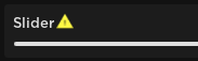
}Here is an example of what the default warning Library.Icons.Warning looks like in-game:
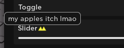
Here is an example of what hovering over these look like:
Please remember that this is a very early release, so there are likely to be bugs, typos, and other problems regarding Atlas and this documentation. If you have feedback or want to report a bug/typo, join our discord server in the topbar of this page and let us know. Thanks!
Security
Atlas UI Library is a UI library only and has little to no security measures. We expect you to take care of this on your own as everyone does this their own way. If you don't want to do it yourself, we reccomend services such as Luauth or Luaguard that will handle it all for you.
Version 1.0 (8 April, 2020)
Initial Release